
Master Financial Analysis with Data Visualization Techniques

10 February 2025
9 min read


Contents
Recently updated on July 21st, 2025 at 08:52 am
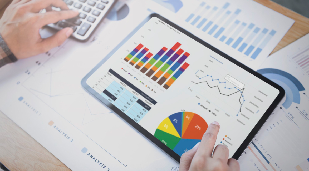
In today’s continually evolving financial landscape, data visualization plays a vital role in analyzing complex financial datasets, identifying trends, and making informed decisions. Raw financial data – often represented in spreadsheets filled with numbers – can quickly become overwhelming, making it difficult to quickly derive actionable insights. However, leveraging the correct visualization tools allows finance professionals to quickly interpret key metrics, spot inefficiencies, and drive strategic decision-making.
Financial data visualization tools like PathQuest BI, Microsoft Power BI, Tableau etc., help you accomplish just that. Using these advanced visualization tools, finance professionals can extract actionable insights, uncover newer opportunities, and make informed decisions about complex financial metrics and trends quicker than ever before.
In this blog, we will cover how financial data visualization tools work, the kind of benefits they offer and how you can unlock data-driven financial insights that significantly impact business strategy.
The Importance of Financial Data Visualization
Financial analysis deals with handling vast amounts of data, from revenue to cash flow statements. Without proper visualization, critical insights can be buried in spreadsheets, making it difficult to identify patterns or anomalies. By transforming complex financial data into intuitive visuals, businesses can streamline decision-making, improve accuracy and enhance overall financial efficiency.
Listed below are some key ways data visualizations strengthen financial analysis:
Simplifies Complex Data
Financial data generally consists of large datasets featuring multiple variables, trends, and timeframes. This makes it a difficult and complex process for analysts to derive meaningful insights quickly. Data visualization tools help to simplify this complexity by transforming those numbers into graphs, charts, and diagrams that make patterns, trends, and correlations more apparent. Instead of reading through dense spreadsheets filled with numbers, stakeholders can simply monitor the progression of trends with a glance at a well-designed chart.
Enhances Data-driven Financial Insights
A key strategic advantage that financial data visualization delivers is its ability to transform raw data into actionable insights. Using visuals to depict financial performance, trends, and forecasts allows analysts to easily identify sectors that are underperforming, areas with the most potential for growth, and other key metrics. For instance, visualizing monthly cash flow enables CFOs to quickly find out months with dips in liquidity, facilitating prompt action to remedy any cash shortages. Visually presented financial data allows decision-makers to grasp insights into their business without devoting a substantial amount of time pouring over spreadsheets or raw numbers.
Improves Decision-Making
The faster you can interpret data, the quicker you can start to make informed decisions. Financial decisions are often executed under time constraints, and the faster you detect trends or anomalies, the faster you respond and change your strategy. Well-designed financial visualizations enable businesses to make data-driven financial decisions that are both timely and well-informed. Regardless of it being a visualization of revenue trends, budget forecasting, or even cost analysis, these visual insights help to streamline decision-making by representing the necessary information in a clear and digestible format.
Facilitates Communication
Quite often, financial reports and presentations tend to be consumed with technical jargon and lengthy explanations. However, data visualizations help to make it easier to communicate complex financial concepts to both technical and non-technical audiences. Whether you are presenting quarterly earnings to investors or describing the budget to various department heads, visualization helps to break down complex information and turn it into digestible formats, ensuring that everyone is on the same page. Ultimately, clear and accurate communication facilitates improved alignment and collaboration among team members and stakeholders.
Increases Efficiency and Reduces Errors
Manual analysis of financial data is a time-consuming endeavor that’s prone to human error. Utilizing visualization tools allows financial analysts to automate several aspects of their data analysis and reporting, significantly reducing the risk of mistakes. Visualization tools also facilitate real-time updates, ensuring that you are always working with the most current information available, which further improves the accuracy of reports and forecasts.
Types of Financial Data Visualization
Different types of data visualization techniques in financial analysis cater to different purposes. Depending on the specific insights you wish to convey the choice of which type of data visualization technique to use will differ.
Let’s briefly go through some of the commonly used types of financial data visualization techniques:
Bar and Column Charts
Bar and column charts are the bread-and-butter of data visualization techniques, commonly used for comparing financial data across different categories. They’re generally deployed to compare things such as revenue across different business units, product sales based on region, or profit margins across various time periods. These kinds of charts are especially useful for visualizing short-term performance or comparing multiple items at the same time.
Use Case:
A column chart can be used to visualize the revenue performance across different fiscal quarters, making it easier to detect trends, peaks, and declines within the data.
Line Graph
Line graphs are ideal for indicating trends over a period of time, making them particularly useful in financial data visualization. They aid analysts to track key performance indicators like stock price, revenue growth, or even economic indicators (e.g.: inflation rates) over a specific time period. By plotting the data points on a line graph, users can easily see the long-term trends and fluctuations that might not be visible in other forms of data presentation.
Use Case:
A line graph leveraged to illustrate a company’s stock performance over the past year can be used to highlight periods of volatility and growth.
Pie Charts
Pie charts are often considered to be simplistic, however they can be quite effective in illustrating proportional relationships. In financial analysis, pie charts are usually deployed to illustrate market share, revenue breakdowns, or expense distributions. This indicates to stakeholders the relative size of different categories within their financial data at just a glance.
Use Case:
Pie charts can be used to break down a company’s expenses report by category (e.g.: payroll, marketing, and operational costs), showing the proportion of total spending allocated within each category.
Scatter Plots
Scatter plots indicate the relationship or correlations between two or more variables. In financial analysis, scatter plots are commonly used to judge the risk versus return, or to assess the relationship between a company’s stock price and external factors like interest rates or inflation. By depicting these relationships visually, analysts can make improved predictions and assess potential outcomes.
Use Case:
A scatter plot can be deployed to indicate the correlation between the return on investment (ROI) and the amount of capital invested across various projects, enabling decision-makers to assess quickly which investments have delivered the best returns.
Heatmaps
Heatmaps are a method of visually representing data density, highlighting those areas with the most significant values. In financial analysis, heatmaps are used to spot patterns in performance, such as detecting periods of high volatility in a stock’s performance or zeroing in on areas of financial inefficiency. The color gradient in a heatmap instantly draws attention to areas that need further analysis and investigation.
Use Case:
A heatmap can be deployed to indicate quarterly financial performance across multiple years, with color variations highlighting how the performance has varied over a period of time.
Dashboards
Dashboards are, simply put, a collection of different visualization tools, brought together onto a single screen to offer a comprehensive overview of a business’ financial health. They can include a variety of charts, graphs, and data tables which are both interactive and updated in real-time.
Use Case:
Dashboards tend to be used for monitoring key performance indicators (KPIs) such as cash flow, revenue growth, and profit margins. They are indispensable for executives and financial analysts alike that need to keep a constant eye on the company’s financial health.
Treemaps
Treemaps offer a hierarchal view of data and are best deployed when visualizing financial data that comprises of multiple layers, e.g. portfolios, revenue streams, or entire business units. Treemaps indicate how individual components contribute to the whole, making the perfect for tracking investments, asset allocation, and expenses in a detailed but intuitive manner.
Use Case:
A treemap can be used to visualize the portfolio of investments, with each asset displayed as a block whose size correlates to its value or market share.
Tools For Financial Data Visualization
For finance professionals, there are many tools available that can be used for creating data visualizations. Some of the most popular tools and what they can be used for are listed below:
PathQuest BI:
A cutting-edge financial analysis software designed to seamlessly analyze and visualize large complex datasets. It quickly constructs compelling visual narratives about operational efficiency, operational KPIs, and business sustainability while highlighting key areas for improvement. PathQuest BI’s ease of use and adaptability helps it stand out as a specialized solution that goes beyond financial reporting by delivering deeper insights tailored specifically for financial professionals.
Tableau:
Renowned for its interface’s ability to intuitively drag and drop metrics, Tableau is one of the most widely used tools for creating financial dashboards, charts, and reports. It emerges as a top choice for finance professionals given its ability to connect to various data sources and update them in real-time.
Microsoft Power BI:
This Microsoft product integrates seamlessly with other tools such as Excel and Azure. Power BI also enables users to create interactive financial dashboards and reports, making it a preferential choice for businesses that need a customizable solution.
Qlike Sense:
If you are looking for robust analytics coupled with visualization capabilities that help businesses gain real-time insights from their data, then Qlike Sense is a great tool. It features an associative model that makes it easy to explore complex financial data and uncover hidden patterns.
Google Looker Studio:
A great and inexpensive option is Google Looker Studio. It is a free tool that offers basic visualization capabilities. It’s ideal for finance professionals seeking accessible, no-cost solutions for representing financial data with clean and simple visualization options.
Zoho Analytics:
A data analytics and visualization platform that helps companies analyze financial performance and trends.
Domo:
A cloud-based business intelligence tool that provides real-time financial performance tracking through custom dashboards.
Conclusion
In the world of finance, financial data visualization has emerged as a game-changer in the way data can be represented and viewed. Coverting complex financial data into easily interpretable visuals allows companies to access data-driven financial insights that improve understanding of the data as well as enhance decision-making.
Regardless of whether you are comparing revenue streams, tracking performance over time, or forecasting future trends; data visualization in financial analysis offers unparallel clarity and depth, the likes of which cannot be emulated by spreadsheets or raw data. Add to that the wide variety of tools readily available, it is now easier than ever to incorporate financial visualizations into your analysis processes, making it an indispensable part of modern strategy.

FAQS
Financial data visualization is the use of charts, graphs, and dashboards to present financial information clearly and visually.
Why it’s important:
- Makes complex financial data easy to understand
- Helps identify trends, risks, and opportunities quickly
- Supports faster, data-driven decisions
- Improves communication with non-financial stakeholders
- Enhances accuracy and transparency in reporting
Data visualization helps in financial analysis by making complex data easy to understand and act on. It allows businesses to:
-
Spot trends and patterns quickly
-
Compare performance across time, departments, or products
-
Identify issues like overspending or cash flow gaps
-
Make faster, informed decisions using visual insights
-
Communicate results clearly to stakeholders
Most Effective Types of Financial Data Visualizations:
- Bar Charts – Compare revenues, expenses, or profits across time or categories
- Line Charts – Show trends over time (e.g., sales growth, cash flow)
- Pie Charts – Display percentage breakdowns (e.g., expense categories)
- Waterfall Charts – Visualize step-by-step changes in profit or cash flow
- Heat Maps – Highlight performance across stores, products, or regions
- Dashboards – Combine multiple KPIs and charts for real-time insights
- Forecast Charts – Show actual vs. projected performance
- Table with Conditional Formatting – Spot trends and outliers in raw data
These visuals help simplify complex financial data for quicker and better decision-making.
Published on: 10 February 2025
John Bugh is Chief Revenue Officer for PathQuest, responsible for the strategic direction, planning, vision, growth, and performance of the company’s marketing, branding, and revenue streams.
As a seasoned professional with over 35 years of experience in executive sales, marketing, and operational leadership, John has worked to build high-performing leadership-teams that have a demonstrated track record of accelerating growth, increasing revenue, establishing sustainability, and improving profitability.
Listen Exclusive Podcast On


Contact Us
Call Now:
+1 (743) 223-2073

