Contents
Recently updated on December 4th, 2024 at 11:14 am
The average person makes 35,000 decisions a day, according to scientific research. While we try hard to apply logic to our decisions, sometimes we don’t have all the information we need and several factors can limit our ability to make the right decision. Research also tells us that many of these decisions are influenced by biases, emotions, and memories.
In business, these decisions are critical. Luckily, in the era of big data, we have the ability to make better decisions based on our client’s historical financial data. But even all this data is useless unless it is transformed into insights we can use. This is the purpose of data visualization. When data is visualized, patterns become more obvious and it is easier to discover actionable conclusions.
How Data Visualization helps in Decision Making
“A Picture Is Worth a Thousand Words”
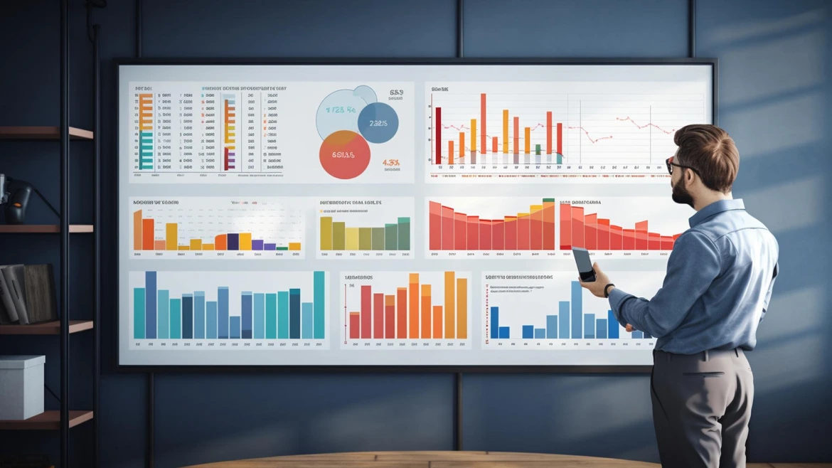
By using charts, diagrams, maps, and other visual elements, data visualization goes beyond presenting numbers to tell a story. With data visualization, the business can spot trends, patterns, exceptions, and opportunities more quickly, and then make informed business decisions with actionable insights.
Data visualization is fundamentally a storytelling tool. Using it, both financial and non-financial users can make key business decisions without wading through complicated spreadsheets with endless columns of figures. Due to the fact that 65 percent of the population is visual learners, facilitating employees’ ability to analyze, interpret, and apply financial data effectively can increase their competitiveness.
Customizing Data to Your Audience
Whenever you are presenting financial data to an audience, it is important to keep them in mind. What is their skill and knowledge level? What do they need to know? What will just add noise?
Modern Business Intelligence tools like PathQuest BI allow you to create custom financial dashboards, so you can tailor reporting to the needs of different audiences within a company.
This is the beauty of visualization. You don’t have to present everything, just the information that each stakeholder needs. For example, the sales staff may need dashboards showing how the sales of a particular product is doing compared to last year. But manufacturing may need a completely different report that shows how inventory levels are trending or how this year’s product returns compare to last year.
Making Data Visualization Work for You
To put data visualization to work for you, you need to know about the two types and when to use them. Both are important and will help you zero in on the metrics that affect your business the most.
Exploratory Visualization
Exploratory data visualization is where you find new insights that you will drill down and may turn into reports for stakeholders. This is where you dig into the numbers to determine the “what, where, when, and how” the data is trying to tell you. Many of your explorations through the data won’t turn up anything, but when you start to notice patterns deep in the data, the insights you find could change your business.
Explanatory Visualization
Explanatory data visualization tells a story. It summarizes and highlights key insights that will be shared with stakeholders. These stakeholders will use this information in their discussions about the future of the business and will help them make important decisions.
Getting Started with Data Visualization
While data visualization was once a nice-to-have option, it is now becoming a necessity for businesses that want to transform their financial reporting into a potent decision-making tool.
Let PathQuest BI help you. With this Financial Analysis Software, you can analyze and visualize large data sets simply and easily. It will help you build interesting visual stories and reveal insights that will make your business more efficient and profitable in the future. To learn more about how PathQuest BI can make you a better decision maker, book a free demo today!
Want to Shift from Manual to Automation?
Discover tailored solutions with cutting-edge features to start your success journey.
Get StartedContact Us

Call Now:
+1 (743) 223-2073


